Understanding website accessibility is the key to getting your business seen by more customers. To learn more, Small Business BC invited two experts to share their best practices and tips in a webinar, and this article summarizes some of their main talking points.
Mhairi Petrovic from Out-Smarts Marketing and Josie Bruels, a graphic designer at Small Business BC, spoke to webinar participants about website accessibility and inclusive design.
Tip: Our Workplace Accessibility Resources page features resources and advice on small business accessibility.
Understanding the Need for Accessible Websites
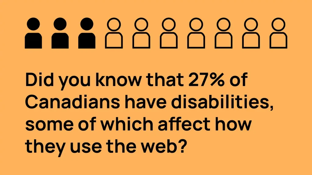 Almost a third (27 percent) of Canadians live with disabilities that can severely impact their online experience.
Mhairi encourages small business owners to imagine their website as a public park. “Parks are designed with everyone in mind,” said Mhairi. “There is accessible parking, signage, and benches…a website needs the same thoughtfulness.”
Only four percent of websites are accessible to people with disabilities, meaning that not everyone can enjoy their online experiences.
“Many people access and experience websites using tools like screen readers for example, or magnifiers that make text bigger, or voice command software,” said Mhairi. “These tools allow them to navigate online, similar to how someone might use a ramp to access a park.”
Accessibility means making every feature on your website operable so everyone can access it and enjoy the experience. Learning about accessibility can help you improve your visitors’ experience.
The Principles of Website Accessibility
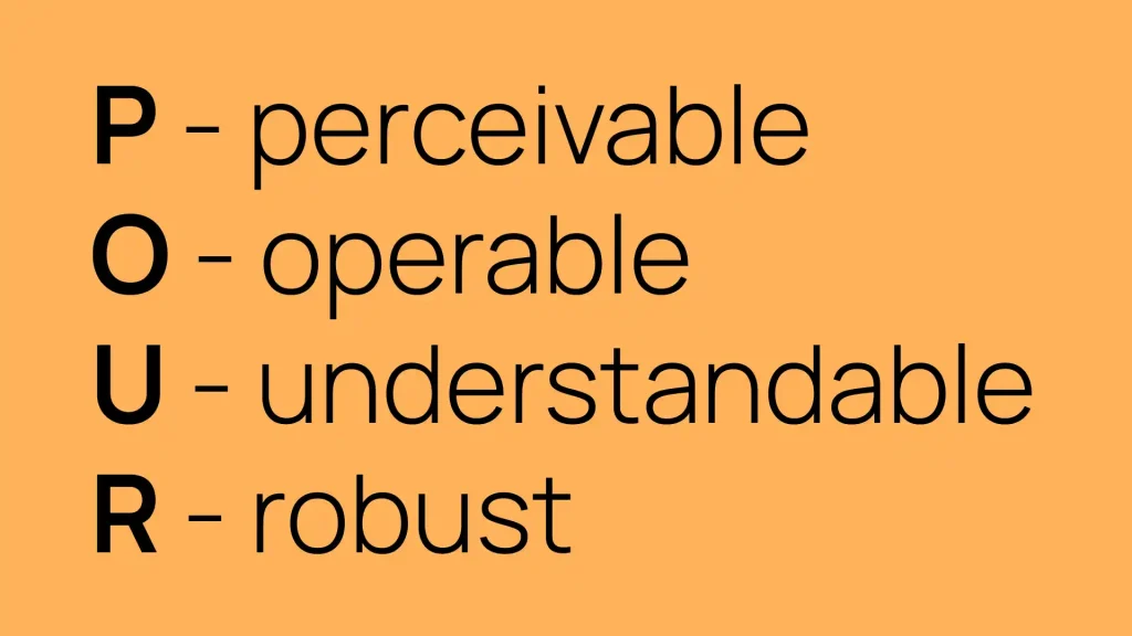
There are four principles of website accessibility, and you can remember them easily with an acronym: POUR.
POUR stands for Perceivable, Operable, Understandable, and Robust.
Perceivable
- Users can identify the content and interface elements of a website through their senses.
- Ex. users can visually or auditorially navigate the website and digest the content.
- Note: Perceivability’s main consideration is designing for people who are blind to navigate your website as easily as someone who is sighted.
Operable
- Websites must be able to be used in different ways and website visitors can use the controls, buttons, navigation, and other interactive elements.
- People using assistive technologies like voice recognition, keyboards, and screenreaders must be able to use a website.
- Ex. People can use their mouse, keyboard, and assistive technologies to navigate your website.
Understandable
- Websites should be easy for people to use and have comprehensible content.
- For. the language is easy to digest, and the website functions predictably with easy-to-navigate pages.
Tips for making a website understandable:
- Don’t have too much text – break it up with bullet points, headings, graphics, and images to help people take in the text.
- Be consistent in your presentation and format.
- Have a voice and tone that’s appropriate for your audience.
- Have a style guide and use the same font colours and sizes consistently.
- Have a low (grade 9) reading level.
Robust
- Websites work with all different internet browsers and are compatible with assistive technologies
- Ex. older internet browsers are supported, and screen reader use is supported
Tip for making a website robust:
- Test that your site is working well on mobile and on all different browsers
These four principles offer a framework for ensuring that your website is accessible.
Web Content Accessibility Guidelines
The Web Content Accessibility Guidelines (WCAG) are a comprehensive set of recommendations that make web content more accessible to people. There are three different levels of conformance: A, AA, and AAA.
Note: Small Business BC is developing a new website that will meet AA standards.
Aim for achieving Level A – this will ensure that all the basic accessibility considerations are covered. For more information on WCAG and tips on getting started with website accessibility, read our guide, Getting Started with Website Accessibility for Small Businesses.
Designing for Screen Readers
Screen readers are software applications that allow people with visual disabilities to use computers. They work closely with the computer’s operating system to provide information about icons, menus, dialogue boxes, files, folders, and images.
To improve your website, it’s a good practice to try using a screen reader on your computer so you can understand what it’s like and how to make your website usable for a screen reader.
Tip: to access your computer screen reader tool, check your settings, search accessibility, and then voice over for Mac.
You can practice with the “No Mouse” challenge. Take two minutes to navigate a website using only your keyboard – no trackpad and no mouse. As you navigate, ask yourself:
- Can I access all the features?
- Can I operate all the buttons, sliders and other controls?
- Can I easily tell which page I’m on?
Tip: Use the Tab button to help you jump to the different clickable elements and use the shift tab to go backwards. Enter will click the button and the arrow keys will help you move up and down.
Common Web Accessibility Mistakes
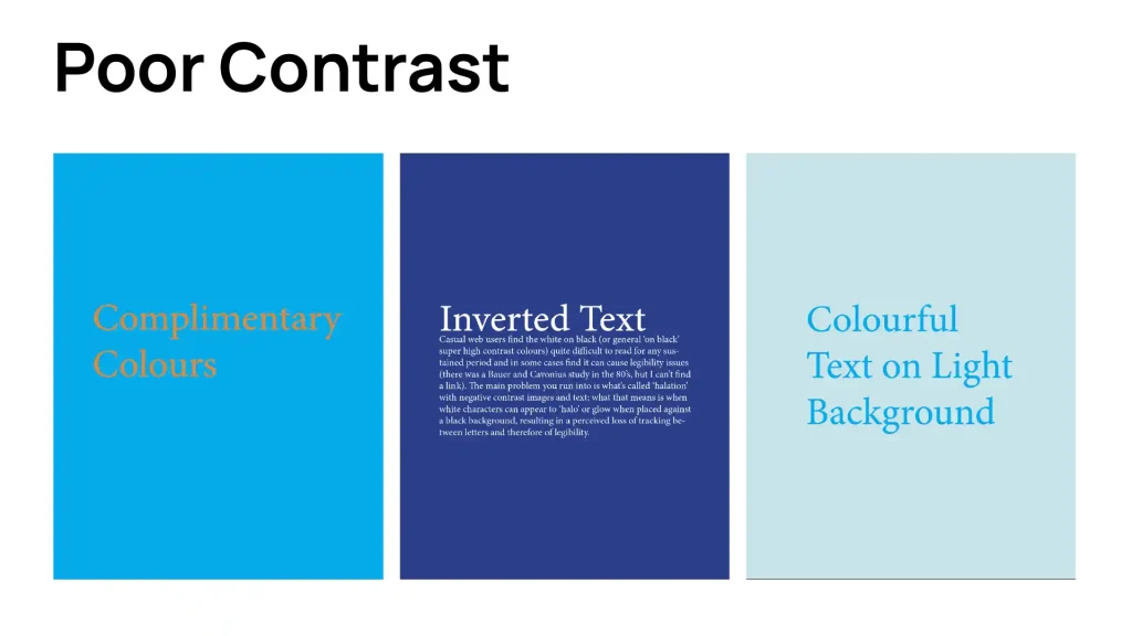
1. Low Contrast Text
If your text has low contrast, it’s hard to read because the background is too dark or too light.
2. Missing Alt Text
Alt text describes what your images are about. If an image is purely decorative, it does not need alt text, but it should be marked as a decorative element. Without alt text, people using screen readers can’t understand your images.
3. Missing Labels
Labels help people navigate your site. Provide labels or text elements to identify all input form controls, including text fields, drop-down menus, and checkboxes.
4. Empty Links and Buttons
When buttons are empty, and links are not descriptive, your website users don’t have enough context to navigate successfully. Empty links and buttons lead to confusion for many, but especially for keyboard users and screen readers.
5. Document Language
In the coding, websites must have a defined document language. Setting the language, to English for example, will help screen readers to accurately interpret the content on the site.
Website Accessibility Fixes
Here are some key takeaways and easy things you can do right now to improve your website accessibility:
Alt Text
Alt text is used on images so that people can know what they are when they’re using a screen reader. As you write alt text, try not to make any assumptions about the picture. Focus on the main focal point of the image, keep it short and simple, and try to provide context for why the image is being used.

Contrast
Having an appropriate contrast ratio with your text and background can make it easy to read. If the contrast is off, it will make your content too hard to read. Good contrast looks like dark text on a light background.
Tip: You can use the Colour Contrast Analyser tool to help you determine if your contrast is high enough.
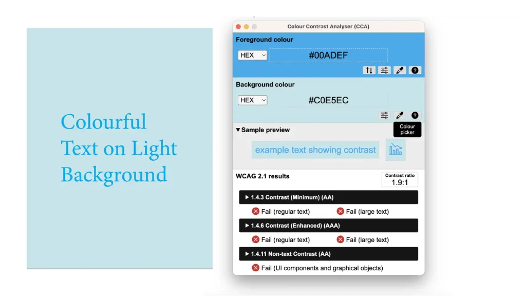
Here are some more tips to keep in mind:
- Do not use complementary colours with text or icons.
- Complementary colours “fight” each other on the page, making it hard to see the text.
- Avoid halo effects on text.
- Do not use colourful text on a light background.
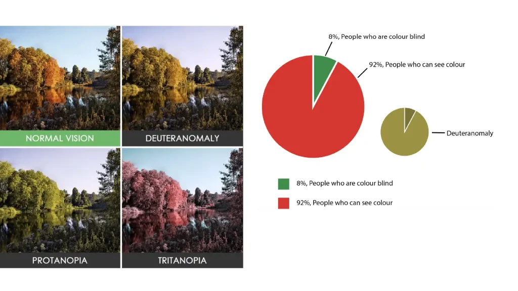
- Not everyone sees colours the same way (ex., 8 percent of people are colour blind), so do not use colour only to convey meaning, for example, in a graph.
Readability
Improve your website content readability by making text easy to read. Use simple words and short sentences to make your point. Use headings and subheadings to structure your content. Make forms as simple as possible for people to fill out and make all links descriptive – instead of “click here” you should describe what the link entails.
Starting a Conversation about Website Accessibility
Ensuring that your website is accessible is not something that you do once. It’s an ongoing commitment. You start, you grow, you build on it, and it becomes more accessible over time.
If you’re planning on building a new website, a great place to start is by reviewing your current site and identifying any pitfalls or downfalls. Also, you can consider working with an accessibility consultant to help take the guesswork out of accessibility planning. Getting some real user experience from users with disabilities will bring even more clarity.
Once you have a more accessible website, start discussing it with your community. Share it in an e-blast, on social media, and your blog. The more we get the word out, the more people will start thinking about accessibility and adopting more inclusive practices.
Tip: Add an accessibility statement to your website in the footer addressing the WCAG standard you have achieved and what you’re working towards.
Accessibility is a journey, not a destination. Remember to regularly review and update your site to keep it up to date with changing standards, as this will evolve.
Continue your Accessibility Journey with SBBC
Small Business BC is a non-profit resource centre for BC-based small businesses. Our Workplace Accessibility Resources page is full of tips, tools, and more to support your next stage.
We gratefully acknowledge the financial support of the Province of British Columbia through the Ministry of Social Development and Poverty Reduction.
