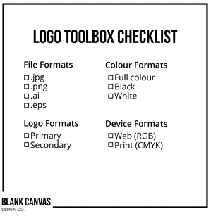
Most businesses have a logo, or some sort of mark to identify their business. But did you know that to optimize your brand, you ought to have multiple file formats and logo formats? I call this your Logo Toolbox, comprised of all the formats you should have access to. Let’s dive into this further.
File Formats
If you are having a logo designed or already have an existing logo, make sure you have it in the following file formats:
- .jpg: Most people use a .jpg file as their primary logo file. This is typically an image file with the logo in the center on a white background. Here’s a little known fact: a .jpg is actually the worst logo file format you can use. Why is that?
.jpg files are files created as one size, therefore if you ever want to blow it up for use on other things, it will start to get pixelated (ie. grainy and fuzzy) and you will lose the nice crisp look of your logo. The other main reason is because .jpgs usually have a white or other coloured background. While this will look fine on a white background, the reality is that you may at some point want to put it on another coloured background or over an image. Imagine your nice logo sitting in an ugly white block over a coloured background – not very appealing.
- .png. This is the format that is a step up from a .jpeg. .png files still give you similar issues with losing clarity when the logo is blown up; however the upside of a .png compared to a .jpg file is that .pngs typically have a transparent background so you will not have the same issues of including a white block on your materials.
- .ai and .eps. To non-designers, these file types might be completely foreign. That’s perfectly fine! You may never need to use them; as they can only be created or opened on a program like Adobe Illustrator. These are files that you would require if you were asked for your logo by a designer, OR needed to send it to a printer for a project. These types of files are essential to have because they are vector files – meaning that the logos are as high res as you would ever need them to be and they can be blown up to any size or shrunk down to a certain extent, without ever losing integrity. Your logo will look just as good on a business card as on a billboard!
Logo Formats
Most businesses have one logo format and think this is all they will ever need. But as media have evolved, businesses and their branding have needed to adapt and become versatile. This is why it’s important to have multiple logo formats.
- Primary logo. This is just as the name explains, the logo that you will use the majority of the time. It can also be described as the full version of the logo, typically comprised of an icon or mark, and text.
- Secondary Logo. This is the one that many clients will not have, and is essentially a simplified or alternate version of the logo that still communicates the same brand. I would recommend that this be a square or circle format or something that would center nicely in a square. Why is this version important? For one, sometimes logos that contain text run into trouble when they are shrunk down. The smaller it becomes, the harder it is to read. The other reason is that you may enter a situation where it is helpful to have a simpler version of the logo – the best example of this is on social media profiles and for your website favicon. The square format is recommended because they work best for these and most other applications.
When designing your primary and secondary logos, communicate with your designer about what you will likely use your logo for. If you want to primarily use it in a banner format (on letterhead, website header, etc.), then a horizontal orientation might be one version to create. Think about your most common uses and plan accordingly!
Your company may choose to have other additional formats, but try to limit them and make sure that your brand identity is consistent throughout.
Colour Formats
For every logo you have, the colours used in the files are also very important! Colours appear very differently in print than on your computer or phone screen. Your logo toolbox should include two types of files, RGB (or web) which includes the web colours and CMYK(or print) which is the logo in its equivalent print colours.
In addition, make sure your actual logo has different colour formats, again so it can be used on multiple backgrounds with no issue. I recommend at least having your logo full colour and all-white version which typically appears the best on coloured backgrounds and photographs.
Here’s a quick checklist for your logo toolbox:

